| Home | <- Week 2 | Week 4-> |
Baayen 2008: Ch 3
Dalgaard 2008: Ch 3
Johnson 2008: Ch 1
The way in which you structure your data, before you ever load it into R, will greatly affect the ease with which you can do your analysis, so I figured I'd spend some time talking about how to do that.
This advice applies mostly to researchers working with observational data.
Over-collect: When collecting data in the first place, over-collect if at all possible. The world is a very complex place, so there is no way you could cram it all into a bottle, but give it your best shot! If during the course of your data analysis, you find that it would have been really useful to have data on, say, duration, as well as formant frequencies, it becomes very costly to recollect that data if you haven't laid the proper trail for yourself.
Preserve HiD Info If, for instance, you're collecting data on the effect of voicing on preceding vowel duration, preserve high dimensional data coding, like Lexical Item, or the transcription of the following segment. These high dimensional codings probably won't be too useful for your immediate analysis, but they will allow you to procedurally exract additional features from them at a later time. By preserving your high dimensional information, you're preserving the data's usefulness for your own later reanalysis, as well as for future researchers.
Leave A Trail of Crumbs Be sure to answer this question: How can I preserve a record of this observation in such a way that I can quickly return to it and gather more data on it if necessary? If you fail to successfully answer this question, then you'll be lost in the woods if you ever want to restudy, and the only way home is to replicate the study from scratch.
Give Meaningful Names Give meaningful names to both the names of predictor columns, as well as to labels of nominal observations. Keeping a readme describing the data is still a good idea, but at least now the data is approachable at first glance.
These are useful principles for organizing the data you collect
Rows = Smallest Granularity Every row should represent a single observation at the finest grained level of your observational tools. If, for instance, you have a record of where a baby was looking (Target, Distractor, Other) for every milisecond of trial, then every row should represent one milisecond's data. Things like Trial Type, Subject Age, etc. which will be shared by all observations from a single trial can be coded in separate columns. It is very easy to downsample your data from this kind of format, and impossible to "upsample."
Columns:
Responses You'll probably only have one response, or dependant variable for the data you're collecting. However, it's not inconcievable that you might have more than one response for a dataset.
HiD Labels Like I said, keep these in here.
Predictors These columns should represent some single feature of observations. What to do about observations which are undefined for some feature may depend on your statistical purposes, but it's a pretty safe bet that they should be left blank, or given an NA value. **Important:** For numeric variables, don't use 0 to mean NA. For a numeric variable, 0 should mean 0.
I was recently working with some data which was coded for sentence type (Question, Declarative), as well as for some subtypes (Yes/No, WH-). My suggestion is that even though sentence subtypes will be non-overlapping, and can all be put (crammed) into the same column, they should not be. "Question Subtype" and "Declarative Subtype" should be separate predictors, since they are separate features of observation. The QSubtype should probably be given NA for all sentences which are not Questions, and the same for Declaratives.
All data we work with are going to be observations of some kind. Understanding what kind of observaton we have made will be crucial in carrying out the correct statistical technique, since different kinds of observations have different kinds of properties. Johnson 2008 has a rather good discussion of the different kinds of observations at the beginning of Chapter 1, and I reproduce some of it here.
Nominal observations are named, but have no meaningful scale or magnitude relationship. No particular value for this observation is greater than or less than another. If you collected duration measurments for /s/ and /sh/, then the consonant labels "s" and "sh" would be nominal observations (expressions like "s" > "sh" or "s" = 2*"sh" are meaningless). Other examples include speaker sex, race, dialect, or records of success vs. failure on a series of experimental trials. In R, nominal obervations are represented as factors.
The different levels of an ordinal observation can be ordered, but the difference between different levels is not quantifiable. We discussed socioeconomic class last week as an example of this. Assuming that there is some sort of cline along which SEC can be ordered, we can order different SECs along this cline. For example, the expression LowerWorkingClass < UpperWorkingClass is meaningful with this approach. How much greater than LWC UWC is is unanswerable though. Ordinal observations can be represented as ordered factors in R
The distinction between these two kinds of observations is rather subtle, and has to do with whether or not the scales they lie on have meaningful 0 values. Comparing temperature with duration, an object can't really have 0 temperature, but an event can have 0 duration. Also 100 ms is twice as much as 50 ms, but 100* F is not twice as much temperature as 50* F. To measure temperature on a meaningful ratio scale, we would have to measure it in terms of rates of molecular movement, for which there is a meaningful 0 value, and ratio relation between numbers on the scale.
For our purposes, I don't think we need to worry too much about the distinction between interval and ratio observations. The important differences between these kinds of observations for our purposes can be understood this way:
| Nominal: | Discrete, unordered variables |
| Ordinal: | Discrete, ordered variables |
| Interval and Ratio: | Continuous variables |
What is key to statistical reasoning is the assumption that the populations we sample have some kind of distribution. That is, there is a tendency within a population towards a certain value (usually written as &mu), with a given variability around that tendency, (usually given as &sigma or &sigma2).
Here is a brief definition of variance and standard deviations.
To figure out how broadly dispersed around the central tendency the data is, you could subtract out the mean from the sample.
samp <- rnorm(50)
samp
samp-mean(samp)
If you were to sum this vector, the result would be 0 (or at least close to it, due to floating point arithmetic). To get a meaningful sum, we square this result.
(samp-mean(samp))^2
sum((samp-mean(samp))^2)
Now, we have a sum of variance, but obviously this number will be larger if we had a larger sample, so we want to know the mean variance. For complex reasons, we calculate the mean variance by dividing it by n-1 (number of samples minus one)
sum((samp-mean(samp))^2)/(length(samp)-1)
This number is the variance of the sample (s2). The standard deviation (s) is the square root of the variance.
sqrt(sum((samp-mean(samp))^2)/(length(samp)-1))
R has a built in function for finding the standard deviation, which you should use not only because it is easier, but is optimized to avoid the accumulation of errors from floating point arithmetic.
sd(samp)
It is generally assumed that most population distributions are normal, or at least could be transformed to be normal. What is nice about a normal distibution is that it can be defined strictly by a mean (&mu) and standard deviation (&sigma).
R has a number of built in functions that give you access to a few statistical distributions (see here for a comprehensive list). Here are the functions for accessing the normal distribution:
To plot any of these distributions, we can use the curve() function, which takes an algebraic function as its first argument, then plots the function from some value to some other value.
curve(dnorm(x, mean = 0, sd = 1), from = -2, to = 2)
##plots the shape of the density function
curve(pnorm(x, mean = 0, sd = 1), from = -2, to = 2)
##plots the cumulative probability function
curve(qnorm(x, mean = 0, sd = 1), from = 0.022, to = 0.977)
##plots the percentiles against their values
Following the discussion in Johnson 2008, lets look at a ficticious rating task. 36 subject are given a sentence, and are asked to rate its grammaticality on a scale of 1-10. First, let's simulate the data. I do this a little differently than Johnson 2008. I don't know if the difference is significant, but I think my way is more principled.
samp.prob<-dnorm(1:10,mean = 4.5,sd = 2)
## returns the probability of getting a particular rating assuming
## &mu = 4.5 and &sigma = 2
ratings <- sample(1:10, 36, replace = T, prob = samp.prob)
# ^^ this is the step to repeat to get new ratings
Now that we've simulated the data, lets look at the frequencies of each response using table() and plot a histogram of it. (The default behavior for plotting a table is as a histogram.)
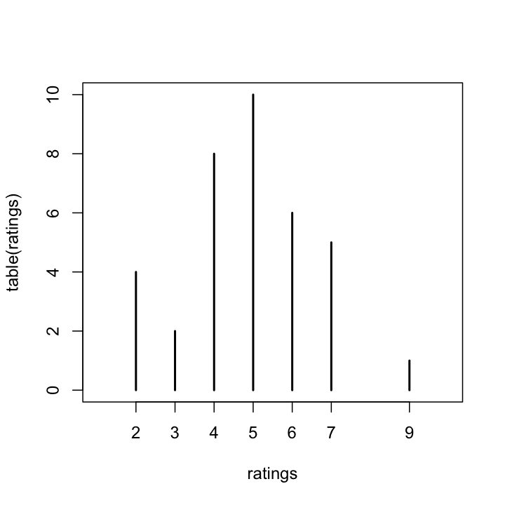
table(ratings)
plot(table(ratings),xlim = c(1,10))
Here is the result I got.
Here, we can obviously see how the data has clustered. It looks the sentence got ratings of 5 the most, followed by 4. With this task, what is the probability of getting a particular response? We can approximate this by dividing the frequency of each response by the number of tokens.
table(ratings) / 36
Based on the data I generated for the plot above, the probability of the sentence recieving a rating of 5 &asymp 28%, and the probabilty of getting a 4 rating &asymp 22%. The probability of getting a 4 or 5 &asymp 50%. This is a little higher than you would expect from the population we sampled.
sum(samp.prob[4:5])
## should be 0.3866681
What would happen if we hadn't restricted subjects to giving us an integer rating, but had instructed them to report grammaticality by moving a slider left to right. We would then be collecting data with continuous values. Let's simulate and examine the data:
c.ratings <- rnorm(36,mean = 4.5,sd = 2)
## rnorm() draws random samples from a normal distribution.
table(c.ratings)
plot(table(c.ratings),xlim = c(1,10))
So, you can see how useless it is like this. The probability of getting the same value on a continuous scale is infinitely low. If we did get the same value twice, it would actually be evidence of the limited precision of our measurement tools. We could try binning the continuous values, then plotting a histogram of frequencies within each bin. hist() does this automatically. We'll give the argument prob the value True, so that the y-axis values will be the probability of an observation appearing in that bin.
hist(c.ratings,prob = T)
##break points can be modified with breaks
##see ?hist
However, if we are willing to assume normality, we can do better than this by examining the normal density curve. Here, we'll overlay it on the histogram we just plotted.
curve(dnorm(x,mean = mean(c.ratings),sd = sd(c.ratings)),add = T)
What is nice about the normal distribution density function is that you can calculate the probability of a number appearing within a given range by finding the area under the curve.
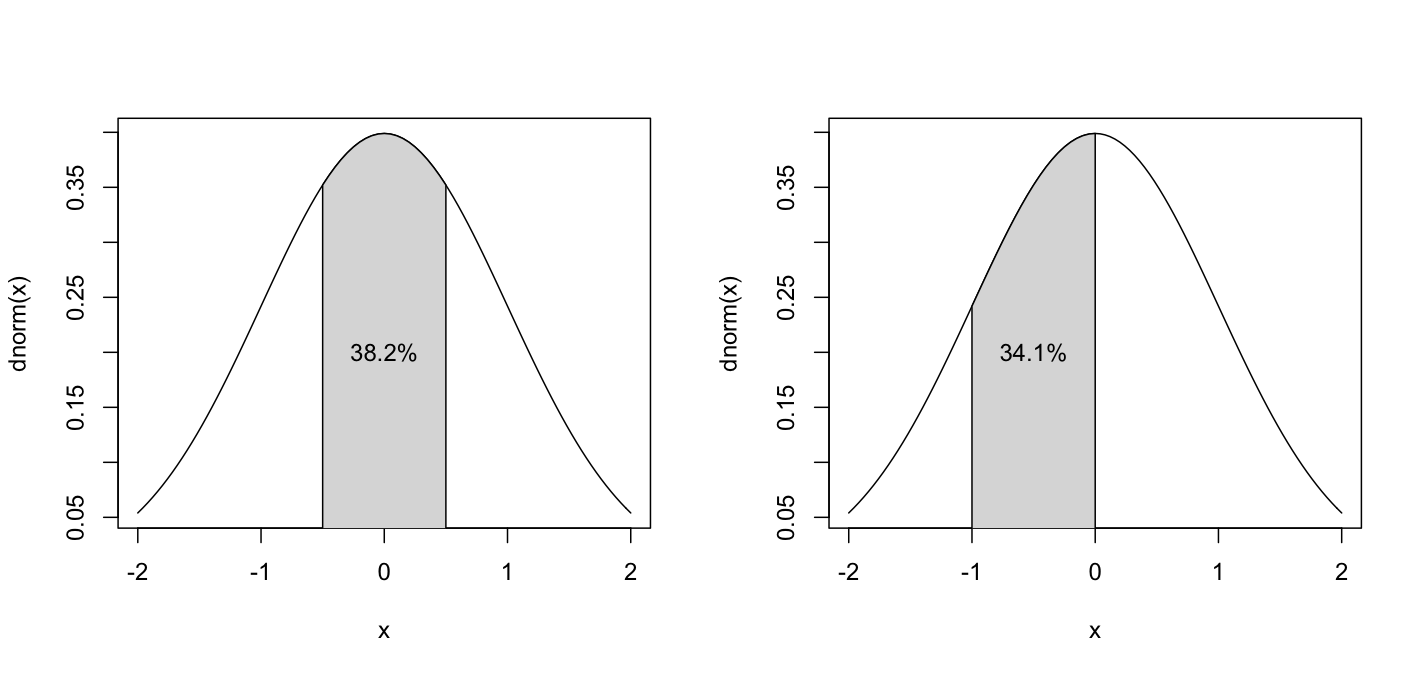
If you were to take a random sample from a normally distributed population 1000 times, you would probably have 1000 different sample means. However, those sample means themselves are normally distributed, and the larger the sample, the lower the variance.
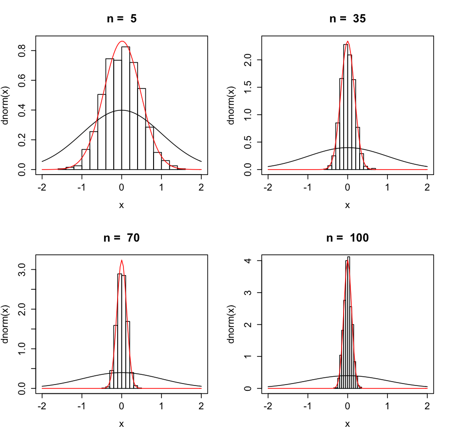
Not surprisingly, if the variance of the population were lower, the sample variance is also lower. The variance of the possible mean values is called the Standard Error of the Mean, and can be calculated as the standard deviation of the sample divided by the square of the size of the sample. The 95% confidence interval of a mean &asymp the sample mean ± (SEM*1.96). Let's look at our ratings example.
r.mean<-mean(c.ratings)
##the sample mean
r.sem<-sd(c.ratings)/sqrt(length(c.ratings))
c(r.mean-(r.sem*1.96),r.mean+(r.sem*1.96))
##95% of means of samples of the same size
##drawn from the same population will be between
##these two values
As Johnson 2008 points out, this reasoning about distributions buys us the following:
This now gives us a boot strap into testing hypotheses about populations from our samples.
Since the normal distribution is so important to many assumptions in statistical test, it's good to know some ways to gauge the normality of a sample. If your data is not normally distributed, then the results of most statistical tests and regressions can be meaningless, so you really really need to inspect the data this way. Here are two graphical techniques, and one statistical test.
First, you can plot the empirical density of the data, and compare that to the density function of a normal distribution with the same mean and variance.
plot(density(c.ratings))
curve(dnorm(x,mean = mean(c.ratings),sd = sd(c.ratings)),add = T,lty =2, col = "red")
Just eyeballing it, the sample looks pretty normal, and it should, since it was randomly generated from a normal distribution.
Another graphical technique is the qqplot.
qqnorm(c.ratings)
qqline(c.ratings)
What this plot does is compare which quantile a point empirically is in the data (the y axis) to what quantile that point would be if it had been drawn from a normal disribution with the mean and sd of the sample (the x axis). I find these hard to interpret sometimes. What is important is that if the points are closely distributed to the line, then the distribution is fairly normal.
The statistical test for normality is the Shapiro-Wilk normality test. It returns a significant p-value if the distribution is significantly non-normal.
shapiro.test(c.ratings)
The p-value is > 0.05, so we cannot reject the hypothesis that the distribution is normal.
Since the properties of a normal distribution are rather well known, we can test hypotheses about means of distributions. The questions we can ask are: Could this sample have been drawn from a population with mean equal to, greater or less than x? Could these two samples have been drawn from the same populations? Are the populatio means of these two samples greater or less than eachother?
The t-test is a test for the job. **Note** t-tests can only be performed meaningfully on data that is normally distributed.
daily.intake<-c(5260,5470,5640,6180,6390,6515,6805,7515,7515,8230,8770)
mean(daily.intake)
sd(daily.intake)
plot(density(daily.intake))
curve(dnorm(x,mean = mean(daily.intake),sd = sd(daily.intake)),add = T, col = "red",lty = 2)
qqnorm(daily.intake)
qqline(daily.intake)
shapiro.test(daily.intake)
Everything looks good and normal. As Daalgard suggests, we may want to know if this sample could have come from a population of women with a mean intake of 7725 kJ.
kJ<-t.test(daily.intake,mu=7725)
kJ
The output of t.test() is the first specialized R object we've come across so far. The default print out is rather useful, but we can also access specific values from the test. To see what all is accessible, use names()
names(kJ)
kJ$alternative
kJ$p.value
This was a two-sided t-test, which means we were testing the hypothesis that &mu = 7725. The p-value is sufficiently low, so we can reject this hypothesis at the p = 0.018 level, and adopt the alternative, that &mu &ne 7725. The default printout actually presents this in a much more readable way, but it' good to know how to access values from an object.
If you wanted to do a one sided t-test, to examine the altenative hypotheses that &mu < or > x, you can pass a value of "greater" or "less" to the alternative argument of t.test()
t.test(daily.intake, mu = 7725, alternative = "greater")
t.test(daily.intake, mu = 7725, alternative = "less")
If you have two samples, and want to see if they could have come from the same population, you want to test if they could have the same &mu. Daalgard has data on energy consumption of people with different satures.
library(ISwR)
summary(energy)
There are two ways you could peform the t-test. Either pass two vectors to t-test, or give it a formula.
obese<-subset(energy,stature == "obese")$expend
lean<- subset(energy,stature == "lean")$expend
t.test(lean,obese)
##or
t.test(energy$expend ~ energy$stature)
The p-value is very low, so we can reject the hypothesis that the population of obese people and the population of lean people have the same &mu when it comes to energy consumption. How big is the difference? The 95% confidence interval give the range we can be 95% confident that &mulean-&muobese lies within.
Again, we could do a one-sided t-test by defining alternative hypotheses
t.test(energy$expend ~ energy$obese, alt = "g")
t.test(energy$expend ~ energy$obese, alt = "l")
If you're willing to commit to the variances of these two populations being the same, then the two-sample t-test can be done with a bit more power. To compare variances, use var.test()
var.test(energy$expend ~ energy$stature)
If this returned a significant p-value, then we could not assume that the variances were equal. However, the p-value is not, so let's do the t-test again assuming equal variances.
t.test(energy$expend ~ energy$stature, var.equal = T)
Looks like we've got a smaller p-value, and a narrower 95% confidence interval, so success.
Daalgard also has data on energy intake from women pre- and postmenstrual women in intake. However, what is important about this data is that it was not collected from different groups of women, but from the same women at different times. It's important to use a paired t-test for this kind of data. Any time a single individual provides 2 points of measurement, sort of pre- and post-treatment, a paired t-test should be used. (If you have more than two data points from an individual, you should do a repeated measures ANOVA, but I don't know how that works yet.)
t.test(intake$pre, intake$post,paired = T)
If for some reason you can't assume normality of a population (because you got a significant result on a Shapiro-Wilk test for instance), you could try using a non-parametric test. These tests make no assumptions about the distribution of the data, except that it is symmetrically distributed around its μ.
wilcox.test(daily.intake, mu = 7725)
wilcox.test(energy$expend ~ energy$stature)
wilcox.test(intake$pre, intake$post, paired = T)