Summer 2010 — R: Functions
| <- R: Functions | Home |
Contents
Intro
Effectively deploying
My approach to this topic will be mostly examples based.
reshape Package
The webpage for the
US War Casualties
The first set of data we'll look at comes was linked to by a post on the Guardian Data Blog. The post is about British casualties in Afghanistan, but we'll be looking at data on US war casualties. That data is located here: http://spreadsheets.google.com/ccc?key=phNtm3LmDZEP-WVJJxqgYfA#gid=0
Now, this data is going to require some processing before it's in a workable format, and a lot of that will probably be easier in the text editor of your choice. Download the data from Google Docs as a txt file, then follow these steps in a text editor.
- Delete the first line
- Delete final 6 lines, starting with "ROUNDING ADJUSTMENTS
- Search and replace all commas with nothing
- Search and replace all quotes with nothing
- Search and replace all hyphens wth nothing
- Search and replace all parentheses with nothing
- Search and replace all spaces with periods
We still need to code which country the data is coming from into the column names. In principle, it might be a good idea to do this by
hand in the raw data. However, we can also do it in a more automated way in R. Save the above changes, then load the data into R using
# Append "Afghanistan_" to the Afghanistan data
colnames(casualties)[2:5] <- paste("Afghanistan", colnames(casualties)[2:5], sep = "_")
#Append "Iraq_" to the Iraq data
colnames(casualties)[6:9] <- paste("Iraq", colnames(casualties)[6:9], sep = "_")
The next step is to "melt" the data with the
data - The data frame containing the data.
id.vars - The columns which define the id variables
measure.vars - The columns which define measure variables. By default, it assumes all non-id variables are measure variables
variable_name - What you want to call the new variable column. The default is "variable", which is pretty fine.
For this casualties data, the only id variable defined in a column is
# melt the data
# 1 indicates the column index
casualties.m <- melt(casualties, id = 1, na.rm = T)
# this is an equivalent call to melt()
casualties.m <- melt(casualties, id = "STATE", na.rm = T)
The resulting
             STATE                 variable value
  1        ALABAMA Afghanistan_HOSTILE.DEAD     8
  2         ALASKA Afghanistan_HOSTILE.DEAD     1
  3 AMERICAN.SAMOA Afghanistan_HOSTILE.DEAD     1
  4        ARIZONA Afghanistan_HOSTILE.DEAD    19
  5       ARKANSAS Afghanistan_HOSTILE.DEAD     5
  6     CALIFORNIA Afghanistan_HOSTILE.DEAD    75
The column
We haven't got this data in a very usable format yet. We need to separate the country information from the casualty type information.
We'll do this by using
## Let's just see what colsplit() produces
head(colsplit(casualties.m$variable, split = "_", names = c("Country","Type")))
## Add these results back onto the dataframe
casualties.m <- cbind(casualties.m, colsplit(casualties.m$variable, split = "_", names = c("Country","Type")))
Now that we have the data in this format, we can recast the data into almost any shape, including various aggregations.
The function to recast data is called
data - The data frame containing molten data.
formula - The casting formula. Variables to the left of the
~ define rows, and variables to the right define columns. A pipe (| ) following the formula defines subsets. value - The column to treat as the value. By default, it assumes that a column named "
value " is the value column fun.aggregate - aggregation function
margins - Which margins to calculate grand summaries for
So, if we want to just see how many states we have observations for for each country and casualty type, we can use the following code:
cast(casualties.m, Type ~ Country)
  Aggregation requires fun.aggregate: length used as default
                      Type Afghanistan Iraq
  1           HOSTILE.DEAD          53   56
  2 HOSTILE.WOUNDED.ACTUAL          56   56
  3    HOSTILE.WOUNDED.EST          52   55
  4        NONHOSTILE.DEAD          50   55
As
We can also use
## Total casualties
cast(casualties.m, Type ~ Country, fun = sum, margins = "grand_col")
                      Type Afghanistan  Iraq (all)
  1           HOSTILE.DEAD         731  3461  4192
  2 HOSTILE.WOUNDED.ACTUAL        4263 27817 32080
  3    HOSTILE.WOUNDED.EST         924  3853  4777
  4        NONHOSTILE.DEAD         272   899  1171
## Median Casualties by State
cast(casualties.m, Type ~ Country, fun = median, margins = "grand_col")
                      Type Afghanistan Iraq
  1           HOSTILE.DEAD         9.0   47
  2 HOSTILE.WOUNDED.ACTUAL        48.5  379
  3    HOSTILE.WOUNDED.EST        12.5   53
  4        NONHOSTILE.DEAD         4.0   10
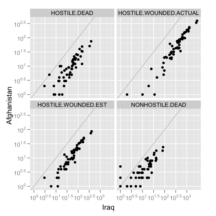
Overall, the Iraq war has been deadlier. We can also compare this at a state by state level.
## Create a data frame for comparison
## If the combination of ID and measure variables
## produces cells which all only have 1 observation,
## cast will fill the cells with that value
casualties.comp <- cast(casualties.m, STATE + Type ~ Country)
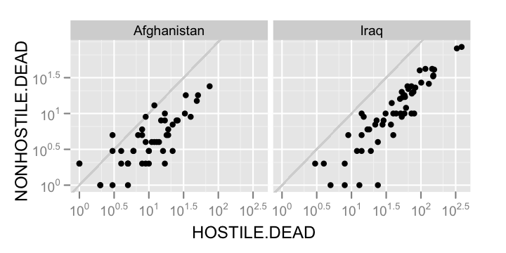
You might also want to compare how one kind of casualty is related to another.
casualties.comp2 <- cast(casualties.m, STATE + Country ~ Type)
As a final exercise, we might try using the pipe syntax in
## Using the pipe syntax
casualties.list <- cast(casualties.m, STATE ~ Country | Type)
## Just print all of casualties.list, or
## plot some if it
qplot(Iraq, Afghanistan, data = casualties.list$HOSTILE.DEAD)
qplot(Iraq, Afghanistan, data = casualties.list$NONHOSTILE.DEAD)
It might also help, conceptually, if we recreated the format that the Gaurdian published the data in.
cast(casualties.m, STATE ~ Country + Type)
It might be useful for you to think about the way you structure your data in terms of a
Gender Gap
This next data set also comes from a post to the Guardian Data blog about gender inequality. You can find the data here: http://spreadsheets0.google.com/ccc?key=phNtm3LmDZENDfX6fD5PSMw#gid=0
Again, we'll do some pre-processing in a text editor. Download the data from Google spreadsheets, then perform the following steps
- Delete the first 8 lines, so that the first line starts "Afghanistan"
- Delete the final 3 lines, so that the last line starts "Zimbabwe"
- Search and replace all commas with nothing
- Search and replace all quotes with nothing
- Search and replace all spaces with periods
- Search and replace all double tabs with single tabs
Like before, we'll add in the column names in R. I did this part by hand, but it's easier for us all to recreate the same steps
if we just copy my code below. Read in the data with
colnames(gender) <- c("Country", "LifeExp_Female", "LifeExp_Male", "Literacy_Female", "Literacy_Male", "Edu_Female", "Edu_Male", "Income_Female", "Income_Male", "Parliament", "Legislators", "Professional", "IncomeRatio")
Looking at the data, there are really two kinds of data sets here. The first compares the status of men and women on a number of different metrics, and the other looks strictly at metrics about women's placement in societies. For our purpose, we'll focus on the former. So, the following code takes the correct subset.
## Only keep the relevant columns
gender1 <- gender[, c(1,2:9)]
Now, like before, we want to melt the data, then use
## Melt the data!
gender.m <- melt(gender1, id = 1, na.rm = T)
## Split the variable column!
gender.m <- cbind(gender.m, colsplit(gender.m$variable, split = "_", names = c("Measure","Gender")))
Now we can do some serious stuff. Let's start by checking how balanced the observations are.
cast(gender.m, Measure ~ Gender)
  Aggregation requires fun.aggregate: length used as default
     Measure Female Male
  1      Edu    178  178
  2   Income    174  174
  3  LifeExp    194  194
  4 Literacy    171  171
All contries in the sample have life expectancy data, but no other metric has data from all other countries
Now let's look at median values for each measure.
cast(gender.m, Measure ~ Gender, fun = median)
     Measure  Female    Male
  1      Edu   74.25   72.05
  2   Income 3994.00 7984.50
  3  LifeExp   74.05   68.30
  4 Literacy   89.20   93.70
Women have higher median educational involvement rates and life expectancy, but lower median literacy rates, and much lower median incomes. Let's compare men and women on each metric.
## Create the comparison dataframe
gender.comp <- cast(gender.m, Country + Measure ~ Gender)
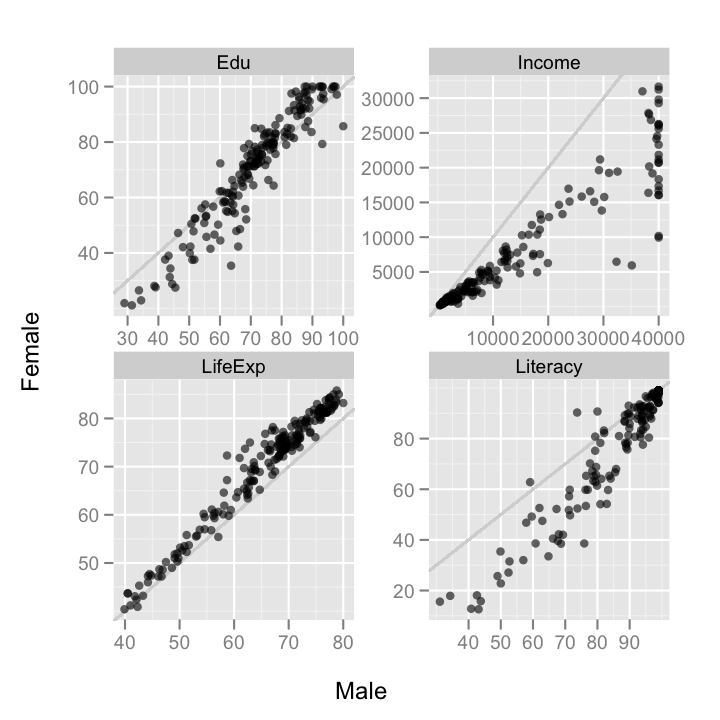
There are a few interesting patterns here. To begin with, it looks mostly like the differences between countries is larger than differences within countries. So, countries with high education, for instance, have both high male and female education. There's also apparently an artificial clipping of reported male incomes. No country reports a mean male income greater than $40,000. I'll be excluding these and other artificially clipped data points in the following plots.
The gender differences within countries are also interesting. The most striking, to my eyes, is that in high education rate countries, women have a higher education rate than men, but in lower education rate countries, men have a higher rate than women.
We should probably also look at how different measures are correlated with eachother.
gender.comp2 <- cast(gender.m, Country + Gender ~ Measure)
Let's start with income and life expectancy.
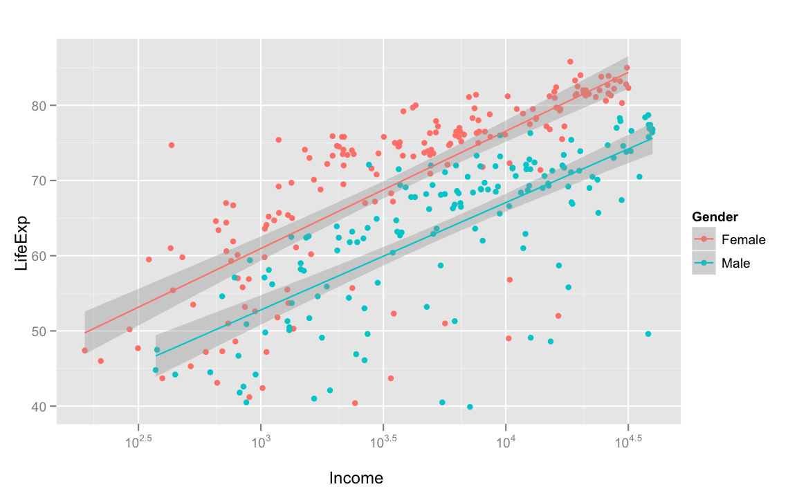
Unsurprisingly, the greater average income, the greater life expectancy is. Women almost always have a higher life expectancy than men of the same average income, but as income increases, life expectancy seems to increase at the same rate for men and women.
Next, education and literacy!
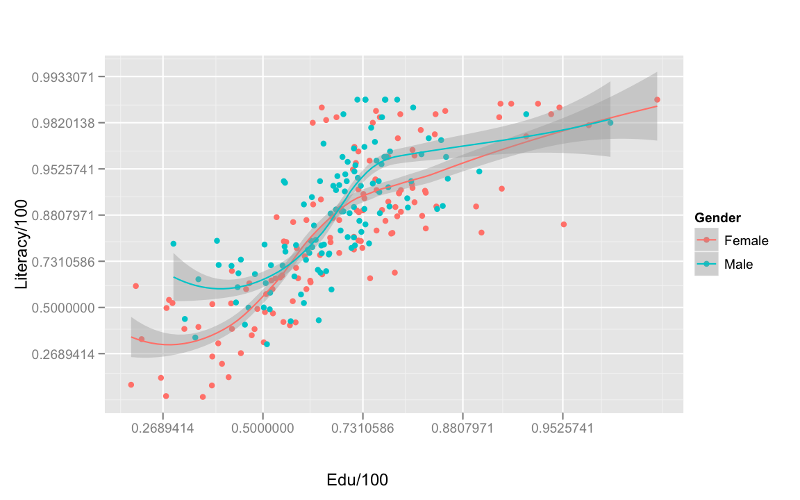
Unsurprisingly, as education increases, so does literacy. The effect of education on literacy also appears to be the same for both genders.
Next, let's look at the effect of education on income!
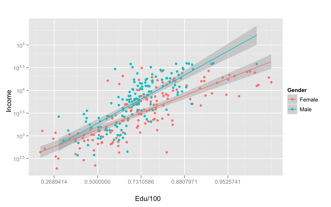
Now that is a strong interaction. Over all, as education increases, average income increases. However, the effect is stronger for men than for women. That is, men get more income bang for their education buck, internationally. For women, the effect of education on income is weaker at the higher education and income end of the spectrum.
We can also visualize this effect by connecting the male and female data points within each country.
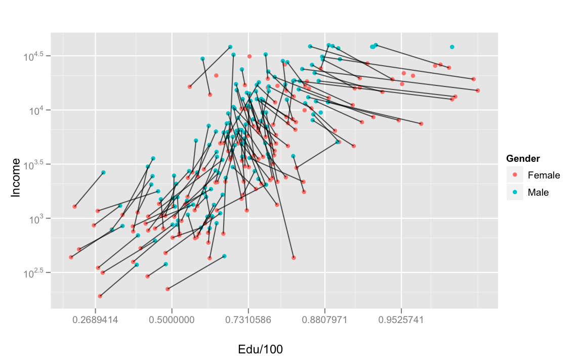
Now, the cross-over pattern in education above makes more sense. The high income countries are also the high education countries, but it's in those countries that women need to have proportionally more education to get the same income benefits. The arbitrariness of this effect should be clear. Women don't appear to be worse learners, as evidenced by there not being a large gender effect on the direct outcome of education, literacy.
Of course, I'm also commiting the environmental fallacy, and maybe others.
Peterson and Barney
I'll use this final set of data to demonstrate some useful aggregation utility in
First, let's load it into R and clean it up a bit.
## Read in the data
pb <- read.delim("http://ling.upenn.edu/courses/cogs501/pb.Table1", header = F)
## Give meaningful column names
colnames(pb) <- c("Age","Sex","Speaker","Vowel","V1","F0.hz","F1.hz","F2.hz","F3.hz")
## Fix up the age data
levels(pb$Age) <- c("Child","Adult","Adult")
pb$Age <- relevel(pb$Age, "Adult")
Next, melt the data.
pb.m <- melt(pb, id = 1:5)
Now, examine the balance of the data.
## How many measurements by age and sex?
cast(pb.m, Vowel ~ Age+Sex)
## How many speakers by age and sex?
cast(pb.m, Age+Sex ~ ., value = "Speaker",
fun = function(x) length(unique(x)))
## How many measurements of each vowel by speaker?
cast(pb.m, Vowel ~ Speaker)
So, the data isn't necesarilly balanced in terms of numbers of speakers in each category, but every speaker produced the same number of each vowel.
Now, let's calculate the mean formant values for each vowel in each category of speaker.
pb.means1 <- cast(pb.m, Vowel + Sex + Age + variable ~ ., fun = mean)
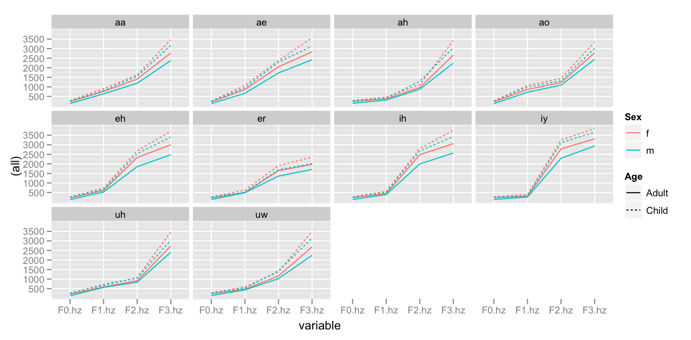
The patterns which seem most clear to me are
- The logarithmic distribution of formant values
- The order of low to high values go
Adult Male < Adult Female < Child Male < Child Female
To calculate speaker category means:
cast(pb.m, Vowel + Sex + Age ~ variable, fun = mean)
To calculate speaker means:
cast(pb.m, Speaker + Vowel + Sex + Age ~ variable, fun = mean)